
Our alumni, Dayafterday, has just announced that they’ll be merging some of their features with Mixcloud. On this blogpost, Bruno, Dayafterday’s co-founder, goes through the features and explains how they created a better user experience. This blogpost was initially published on Medium.
The Music industry is constantly changing, especially in the digital area.
Bop.fm, Grooveshark and Rdio recently closed their door.
Apple Music is becoming a serious player. The try made by Tidal.Soundcloud’s new policies or even Youtube who is also establishing itself in a strong position while competing Spotify, Pandora, Deezer, lastFM, etc..
But for us, Mixcloud has since day one a different approach and a more sustainable business model. On top of a good relationships with artists and labels.
Philosophy
The overall principles behind this Etude are simple : Mixcloud is the music platform we use the most at the present time; it’s also the only way to listen to Tsugi or FreundevonFreunden excellent Podcasts/Mixtapes.
So we took each element one by one, tried to catch their essence and pushed ourselves to see how we could reinforce it even more. With some simplifications or possible new features. Always having in mind Mixcloud’sDNA.
We worked hard on Dayafterday to create a compact collective of creative things on the web. Exploring the connections between music, media and art. We took some inspirations from there too.
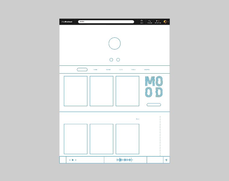
Elements
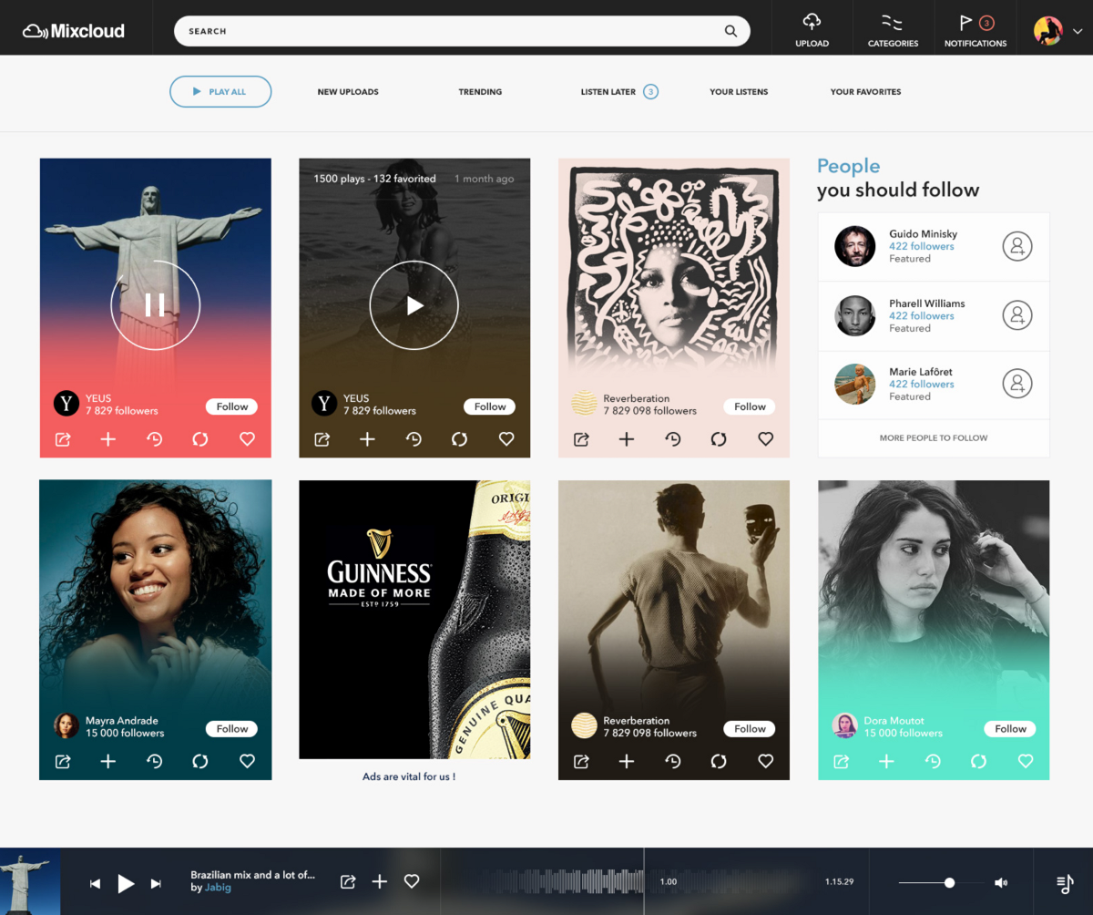
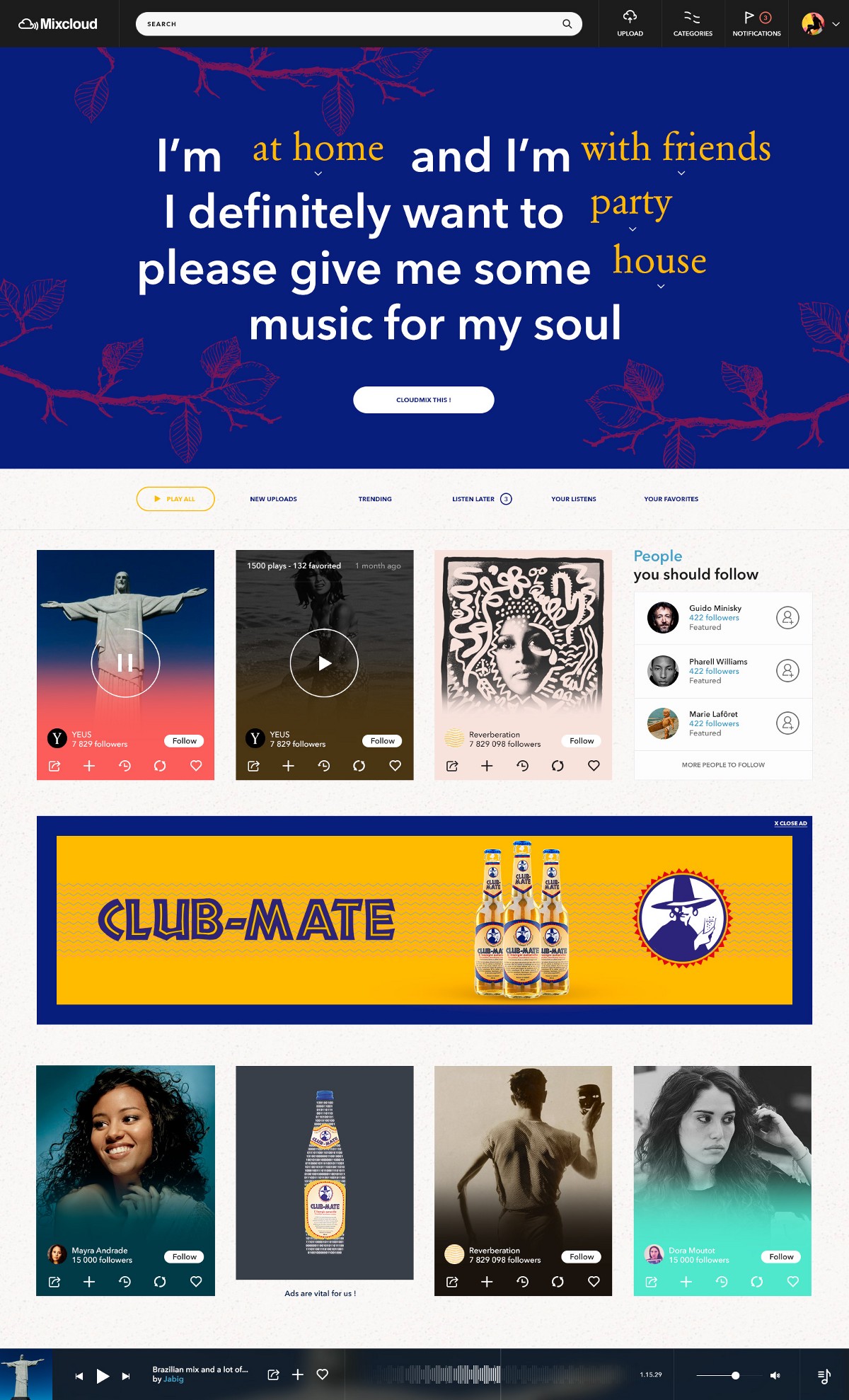
Menu
The menu is one of the key elements, present anywhere/anytime, it must be as simple as possible and focused on what’s really helpful.
We enhanced also the focus made on the search to make it more accessible. In addition to this, we try to offer a more delightful experience by adopting the full width of the screen.

Player
More than a core feature, this is the element with which you interact the most. Here again, our aim was to enhance the key elements of the player.

We reshaped the waveform to make more readable. The idea behind this animation was to recreate the user’s experience in a ludic way, making it similar to an old radio player with which you can really feel that you’re going forward or backward.

We tried to make the playlist a bit more readable using a modal (we do love modals).
Search/Explore
The search/explore feature is something we really care about.
We invest a lot of our time on Dayafterday to make it relevant.
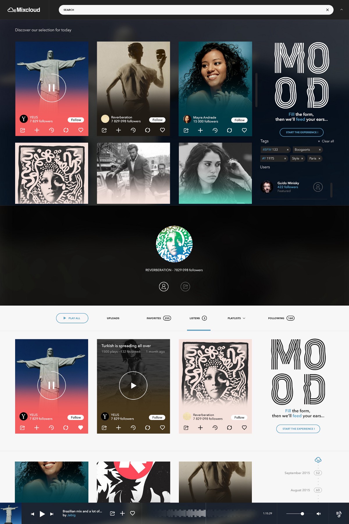
Here as soon as your start typing, all the content is pushed to the bottom and you can immediately start exploring songs/artists.
Via the # search, you can now start searching songs/artists not only based on a name but also on some metadata, like BPM, categories or date of release. The idea behind is even larger to create a kind of game where you could play with all this hidden data. For instance : #27Club to get all the songs from Morrisson, Hendrix, Cobain, etc…#BabySittingWhileMyFriendsArePartying, #2HoursTrip, etc..
In order to never display a white screen, if the research is empty, you can also access some promoted content or other features.
Feed
The feed is key too. We wanted to take advantage of the roll hover to display secondary information, which let us display more songs. That’s also why we used the card system to display a song anywhere on the platform.
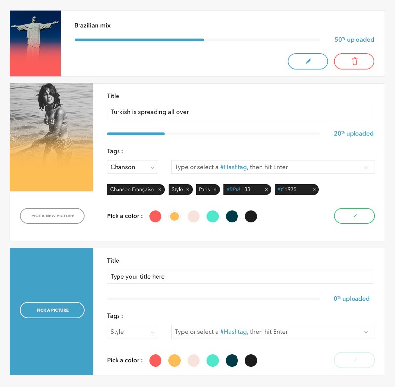
During the upload phase, we let the user select a color of the card. This will give a unique and colorful touch to the feed; without hurting the cover.
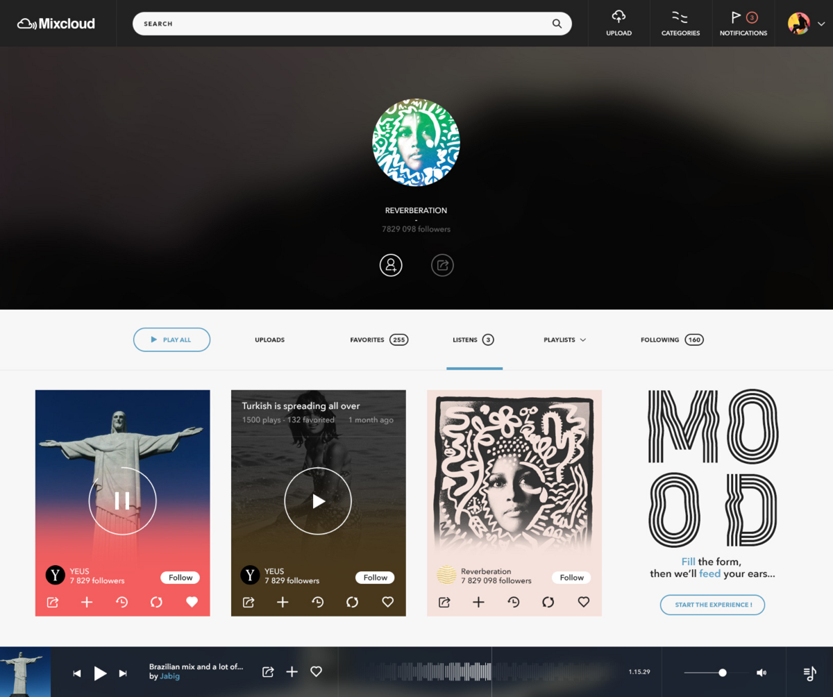
Profile
We applied here the same concepts as in the feed to make it as clear as possible. We wanted to make the overall platform more coherent.
Core features
Upload
This essential step for all the content present on the platform. Via a simple 3 steps process we let you upload multiple tracks at the time. And add more information like the cover, color, tags, etc… This point here is to make this step more seamless.
Ads
Ads are important for Mixcloud. Most of the time we all hate ads (cf. ad blockers). But if they are done properly and are coherent, we can tolerate them.
We tried to make them the less intrusive as possible, but still giving the exposure needed.
Here is an example for full partnership (Club-Mate) but we can easily imagine another kind of rebranding for special events like Coachella orRock-en-Seine.
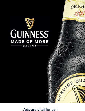
Or here with just simple ad card in the feed:
New features
Memory Cloud
We truly believe in this feature (not only because we will use it a lot).
Wouldn’t it be great if you could return to the past and listen to the exact same song you’ve listened to a week, a month or a year ago?
That’s exactly what memory cloud is about.
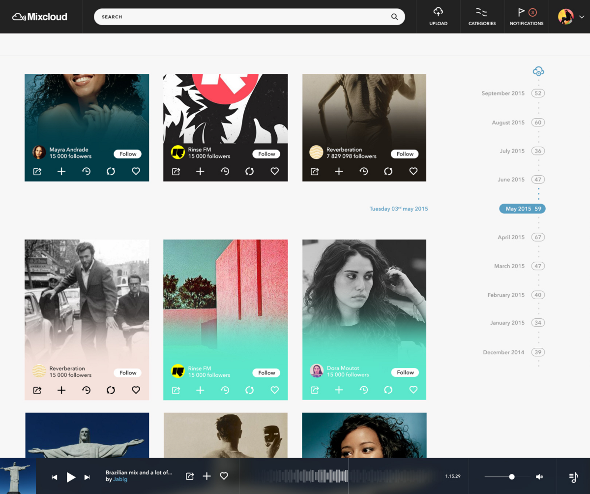
Via this simple timeline you can explore and listen again to your songs.
MOOD
With the propositions made for the search, we hope that it’ll become easier to find something or even explore the entire universe around the song or artist you’re looking for.
But sometime what you want to hear depends on your feeling, where you are and with whom.
The MOOD feature is made for that, creating an on purpose playlist of songs for you.
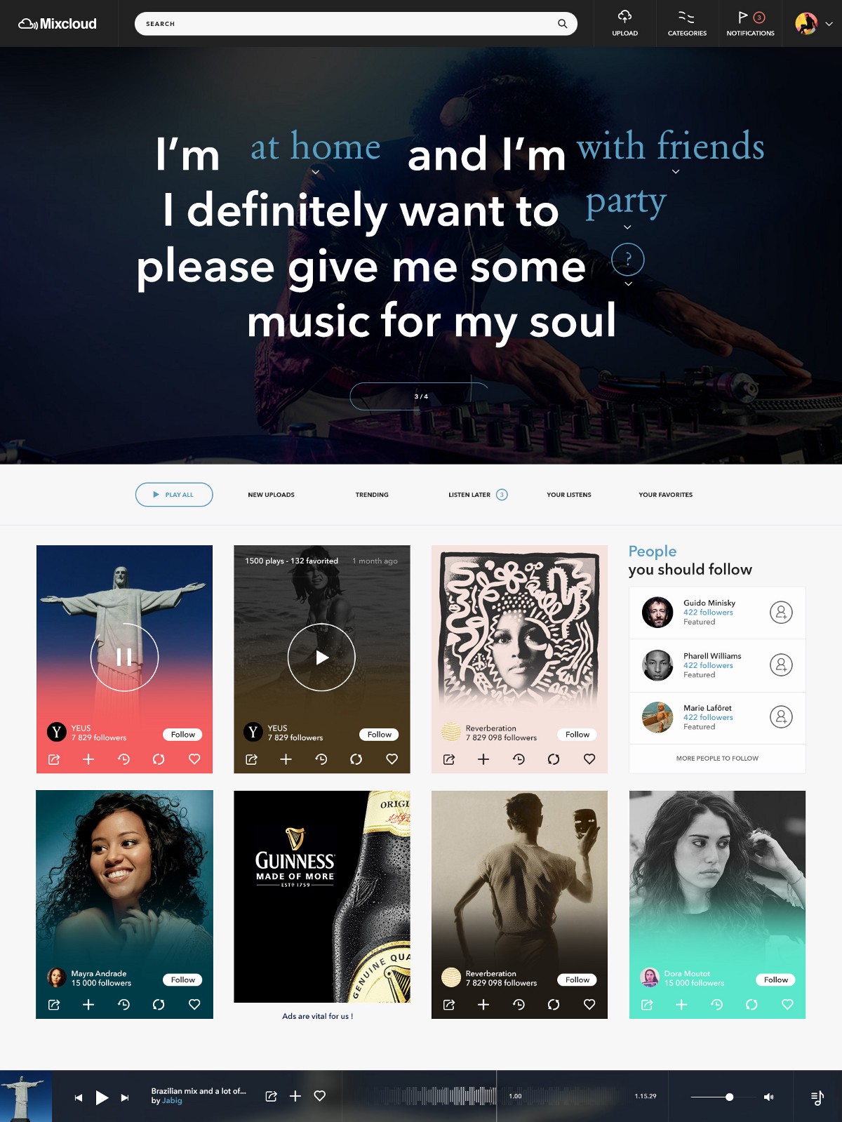
The idea here was to create a specific branding : the MOOD one, to highlight the “Artificial Intelligence” behind that can surprise you by understanding your own musical tastes.
For this feature we wanted to brand it a bit differently compared to the rest of the platform (thanks to Lift Type font). To make it clearly identifiable when you see it.
Sources & Credits
All the elements presented here are available in .psd files here (.sketch files to come too). We also worked on the Mobile/Tablet version and on how to enhance the community side of the platform; stay tuned.
For this Etude, we closely worked with Camille Léonard; we could not have done all this without him.
Camille Léonard : french designer
Gaspard+Bruno : from two men to a digital & design agency based in London & Lisbon.
You can have a look at our others Etudes.
Font for the MOOD feature : Lift Type.
Thanks for reading.


Leave A Comment